Brava
Houston, Texas
-
Project Type
Mixed-Use and Multifamily
-
Developer
Hines
-
Architect of Record
House + Partners
-
Interior Designer
MaRS
-
Total Area
431,953 sf
-
Units
373
-
Retail Area
6,804 sf
There is a simple reason why most buildings are rectangular boxes. It is easy. Easy to build, easy to design, and easy to lay out.
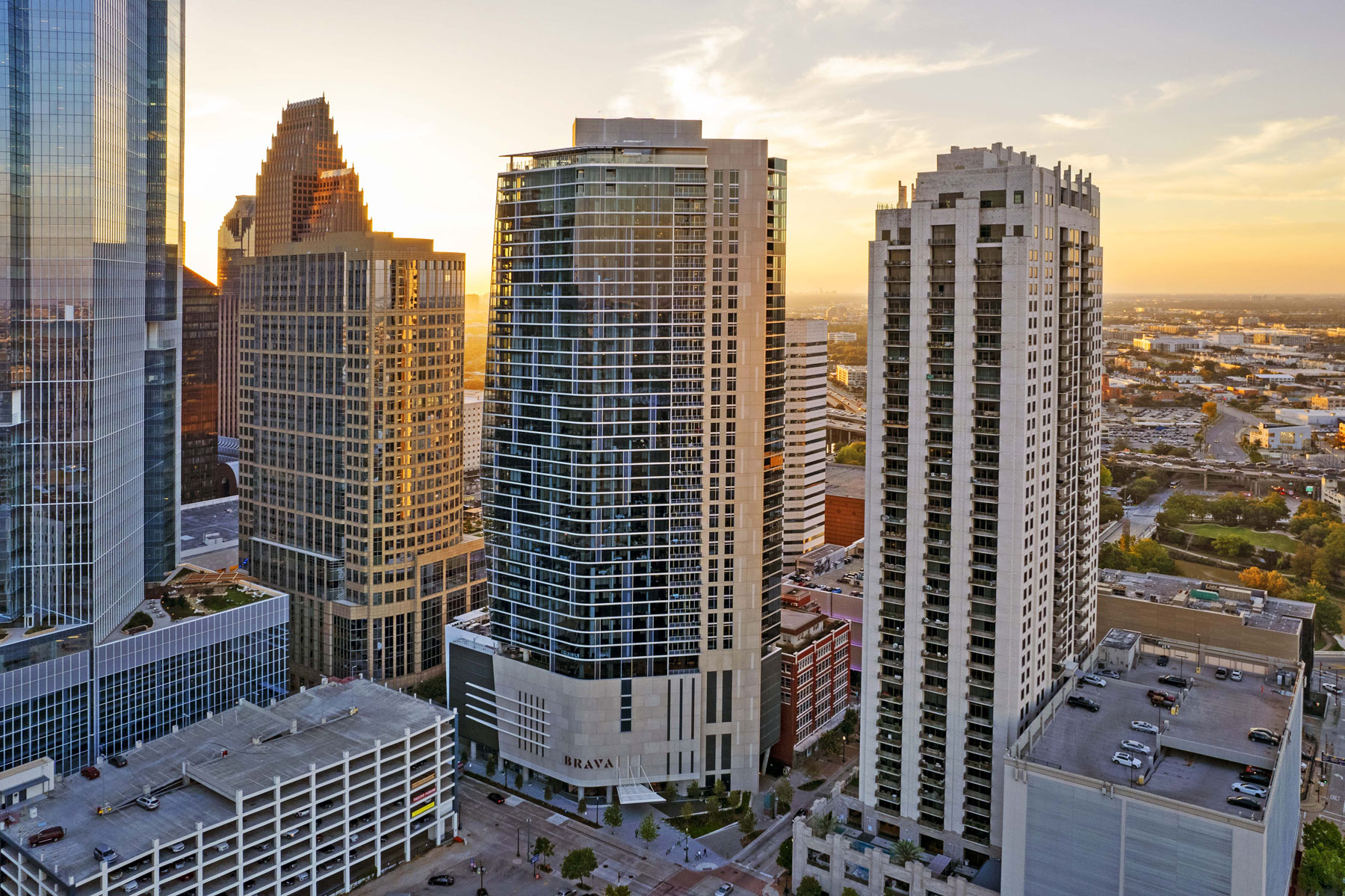
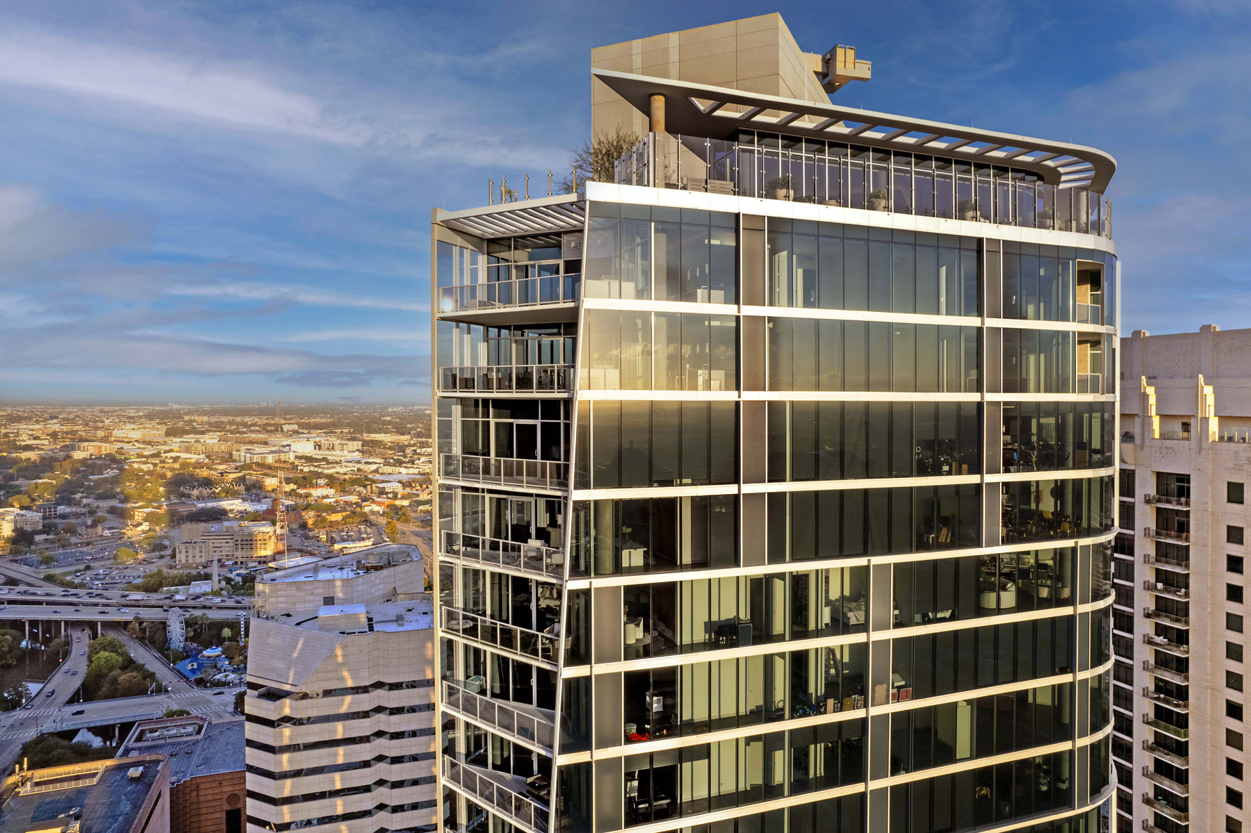
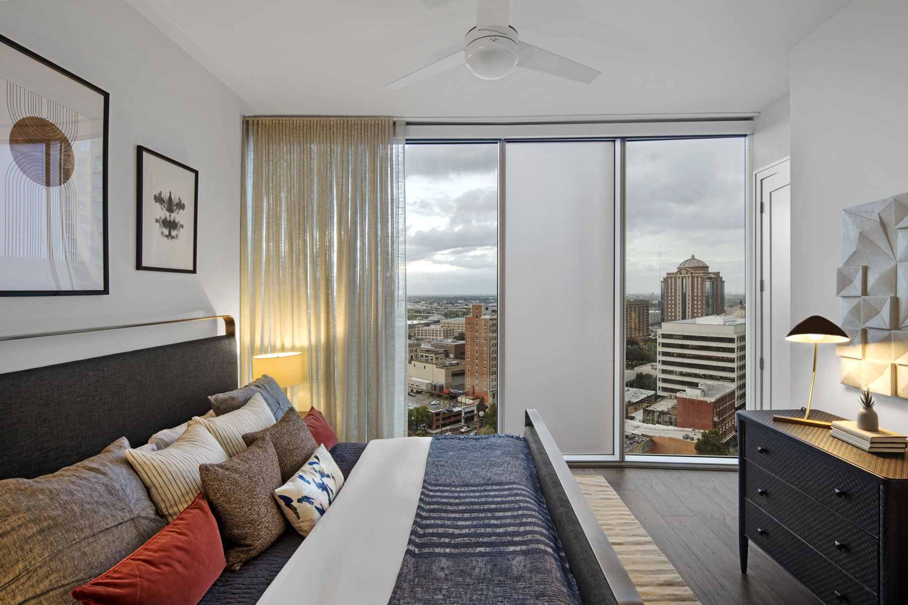
Brava breaks with ‘easy’ and is better for it. Some of the most important considerations when designing a high-rise building are the views. By rotating the building 45 degrees on the site, we are able to provide uninterrupted views to all of the residential units and avoid current and future view obstructions by other buildings. In downtown Houston, the average distance between buildings is 80 feet. This design avoids that constraint for all units in the building. The massing and geometry of the building allow for a dynamic exterior, as well as a unique layout and great views.
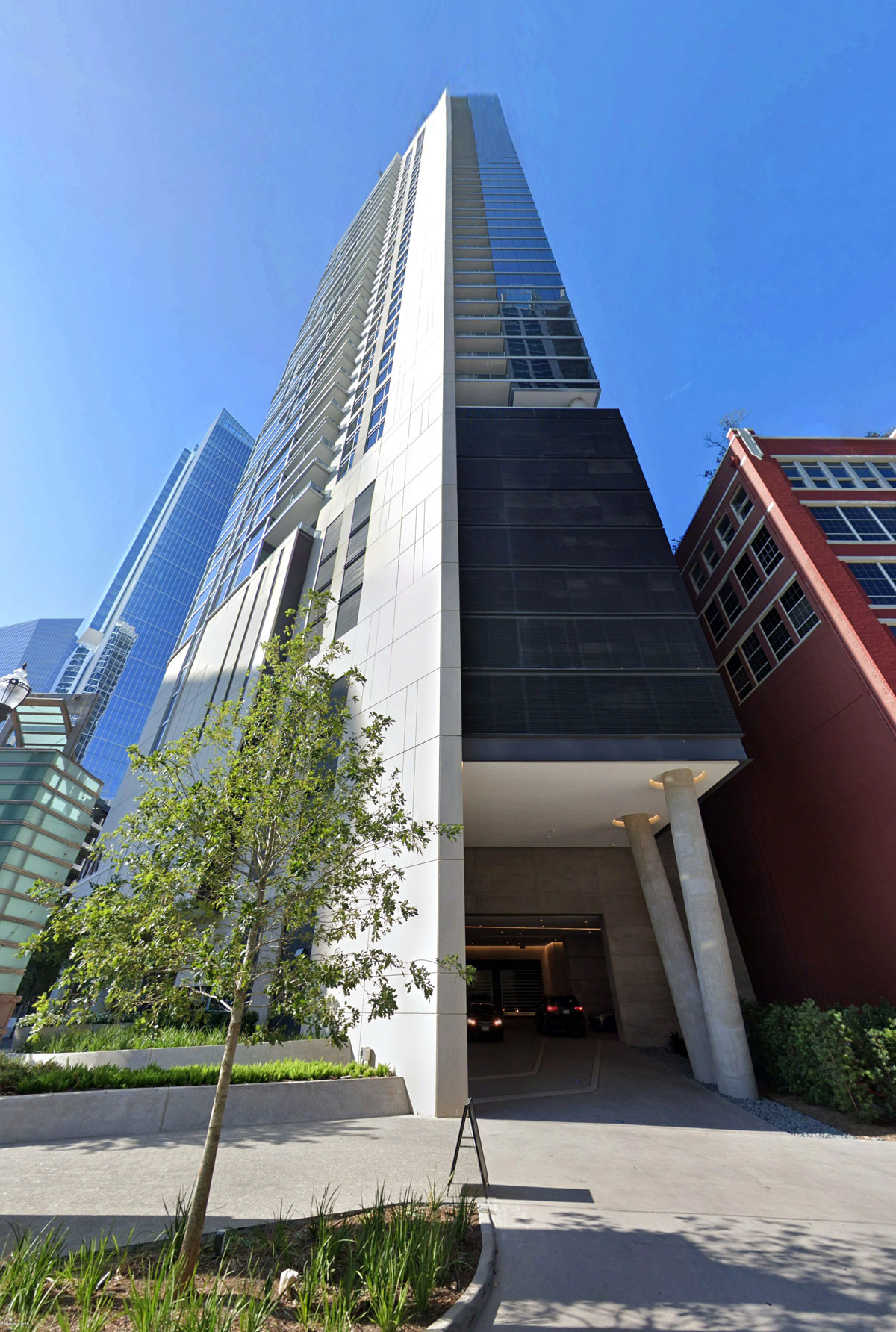
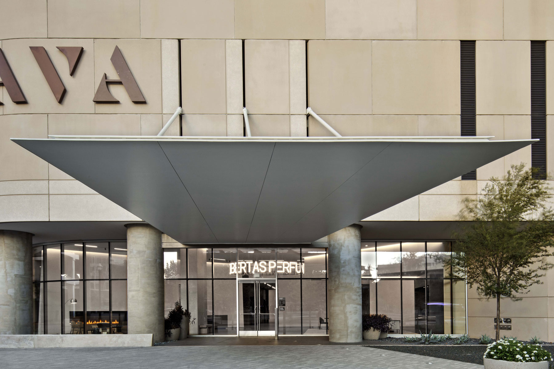
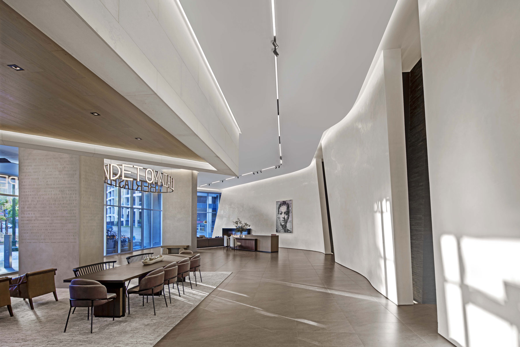
The rotation of the building generates an open urban space at the northeast corner, creating a strong axial relationship from the building lobby to Market Place Park. This urban geometry follows a Houston tradition established by Hines with the Pennzoil Building and many others. Vehicular access is from Preston Avenue and a generous motor court was designed in direct relationship with the lobby, creating a strong and dignified residential entry sequence.
The corner plaza has a subtle slope elevating the lobby from street level, and providing some degree of flood protection. The rest of the ground floor is occupied by retail along Milam Street. The podium portion of the project houses the garage and floats above the ground level functions that are all glazed in.
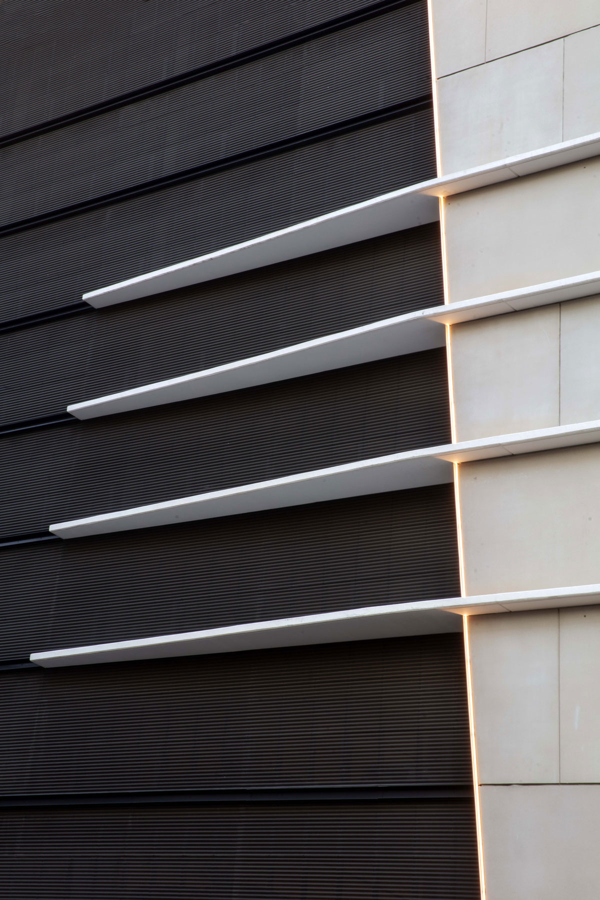
The podium volume peels away toward Prairie Street from a solid, clad volume to a smaller perforated metal box. This effect resolves, in an interesting manner, how the massing of the tower meets the ground. There is a sculpted and illuminated volume still present on Prairie Street expressive of the inner functions of the building. The parking garage has 8 levels with capacity for 517 cars. An important structural accomplishment is designing a diagonal tower to fit above a rigid rectilinear parking garage. The building core and its columns required a special level of care and attention to design.
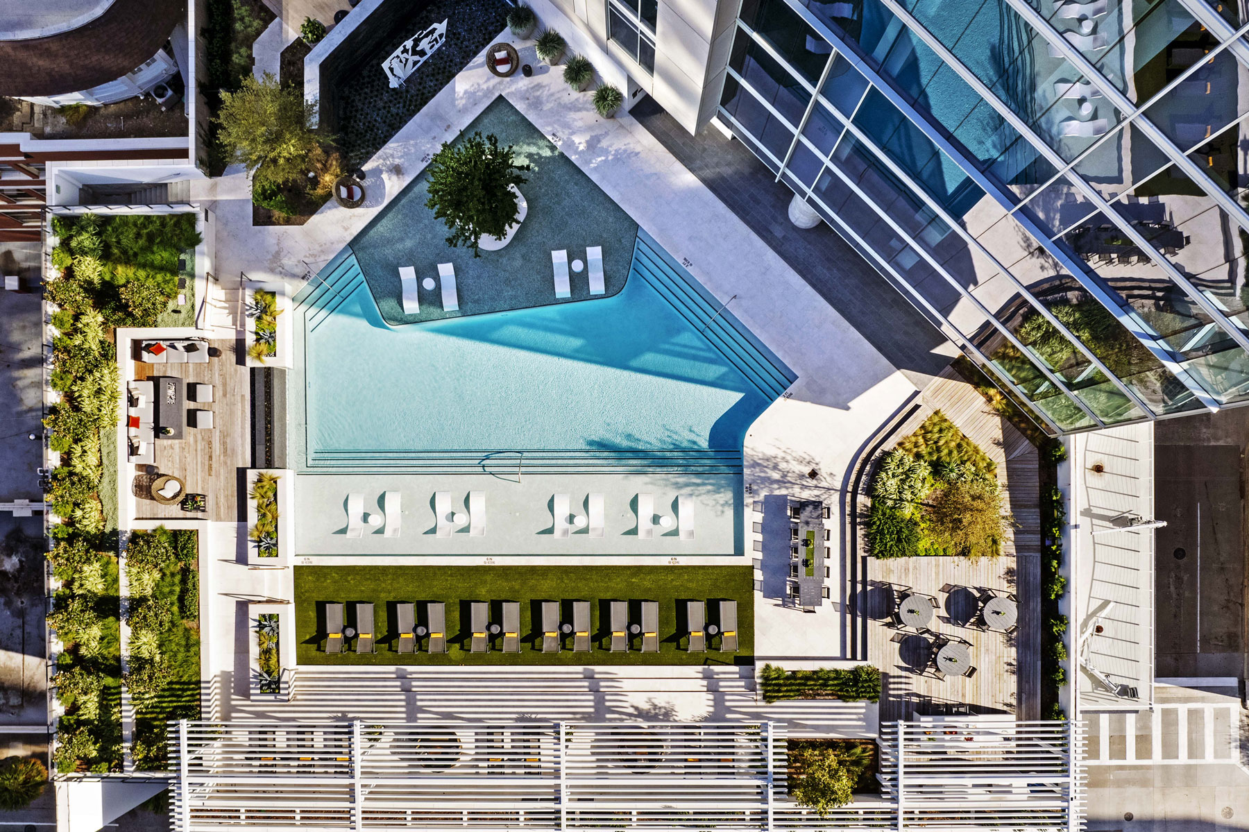
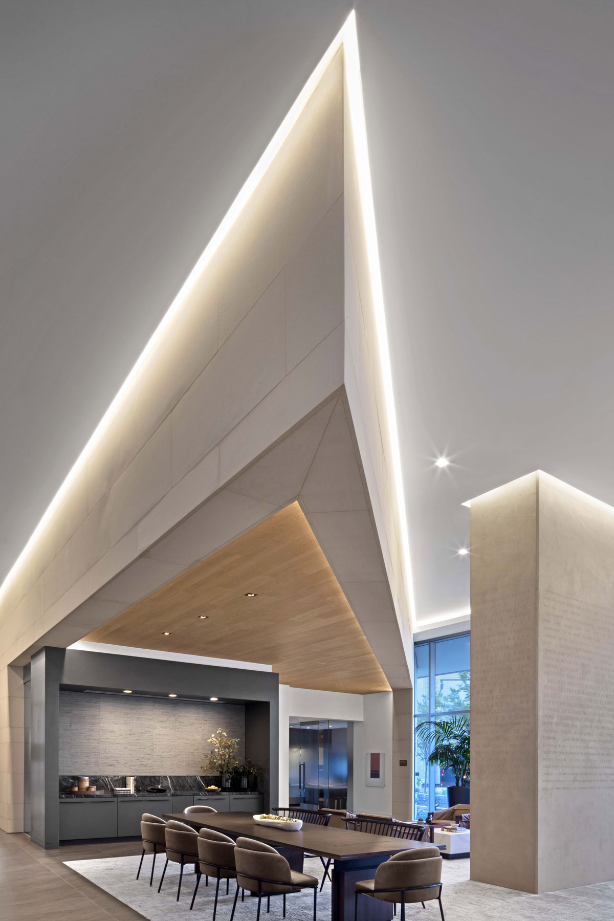
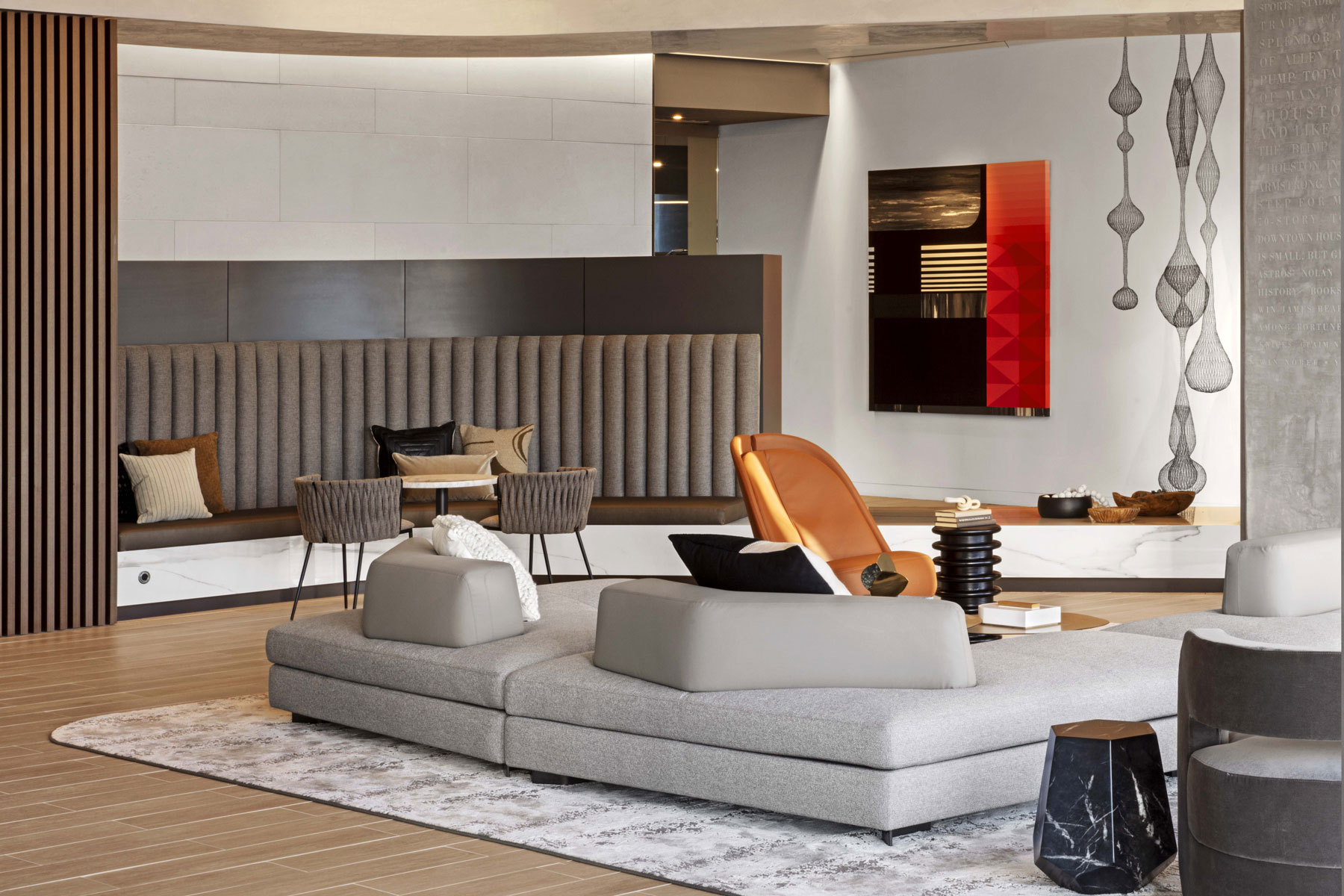
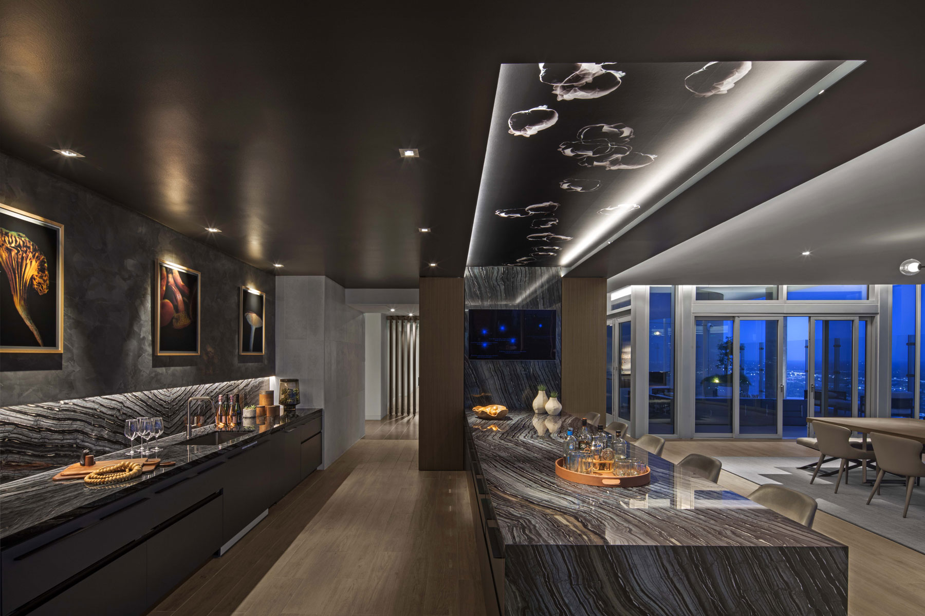
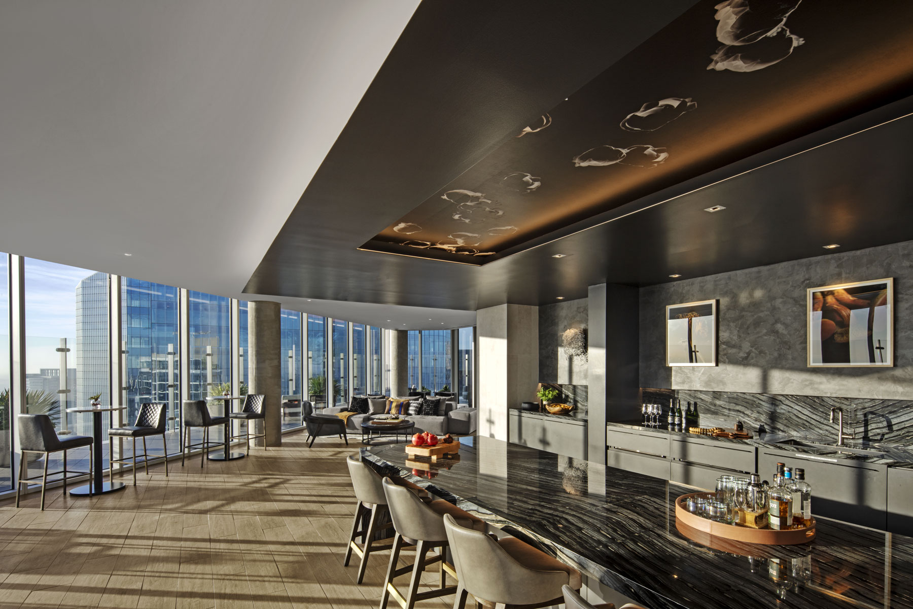
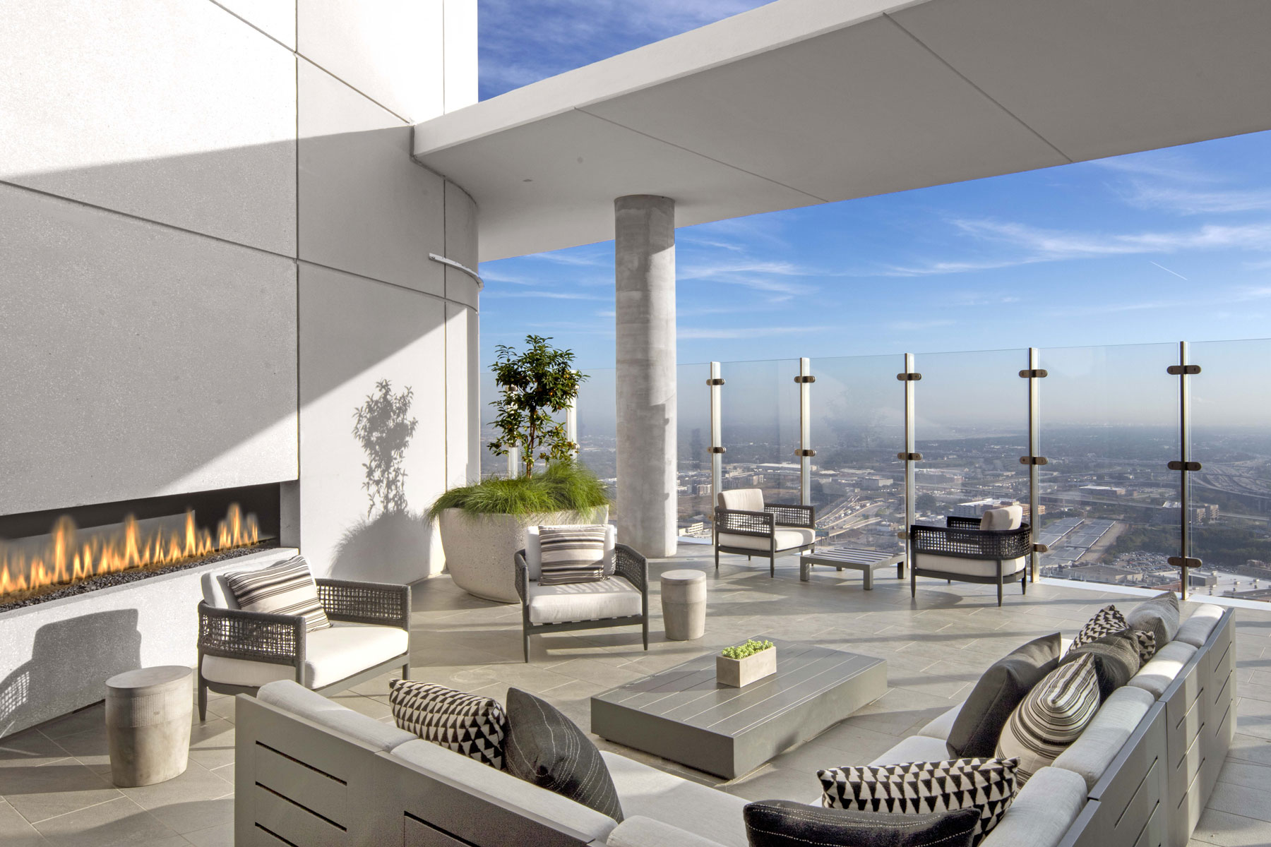
Level 10, on top of the parking podium, is fully dedicated to the residential amenities. The amenity program includes a fitness room, fitness on demand, collaborative workspace, conference rooms, lounge areas, a demonstration kitchen, dining area, and aqua lounge. The exterior amenities include a swimming pool and sun shelf area, lush landscaping, cabanas, grill area, and lounge areas.
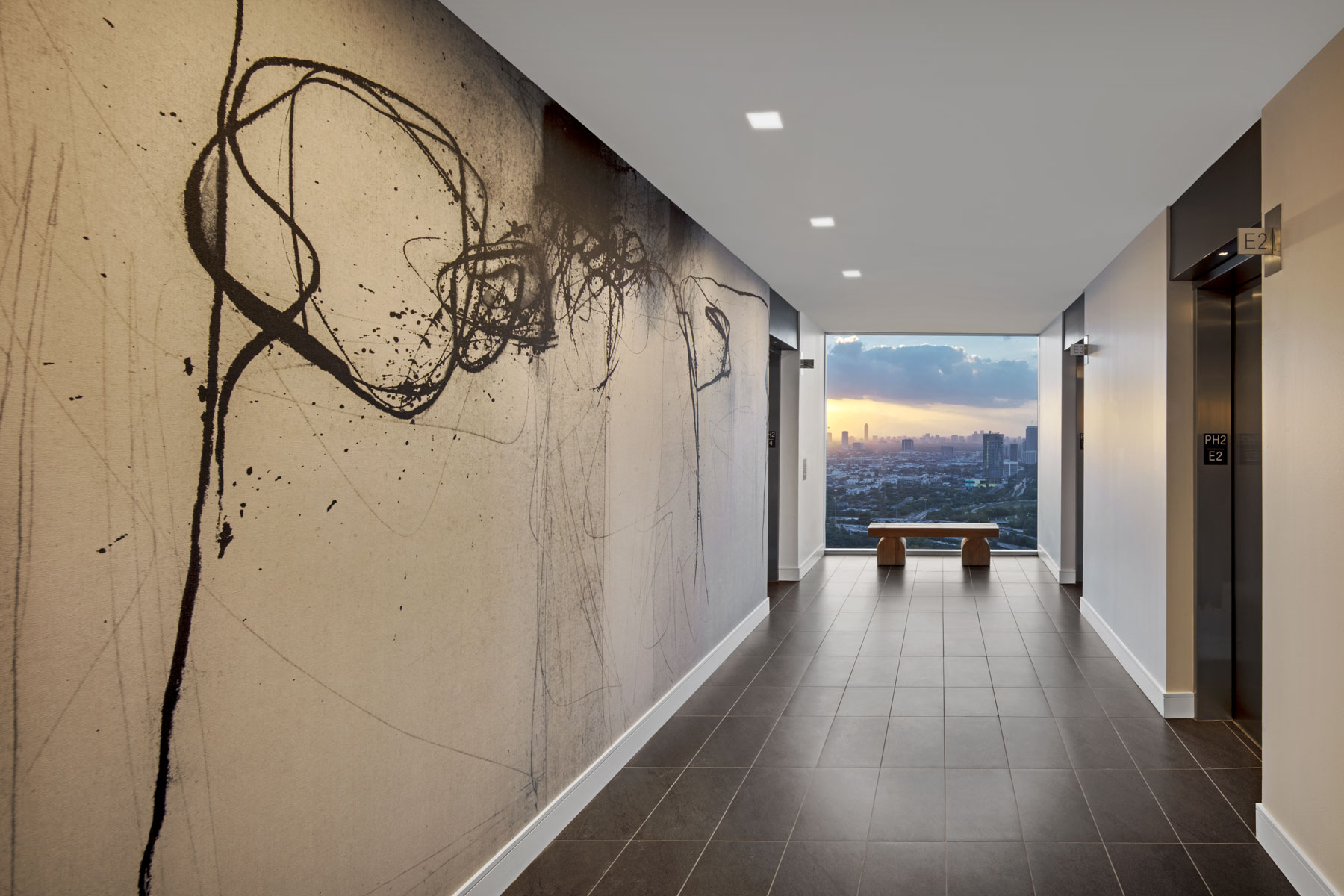
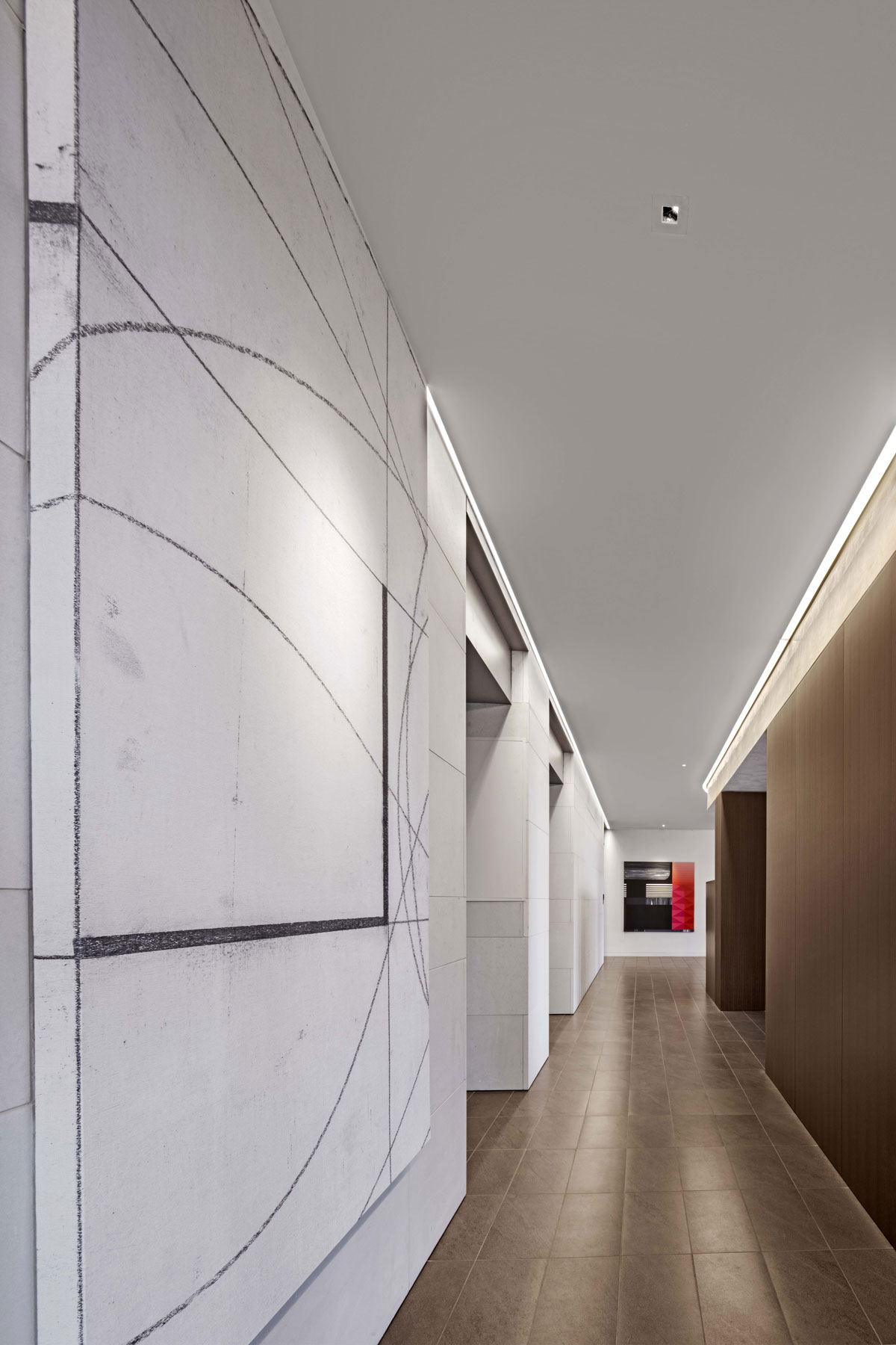
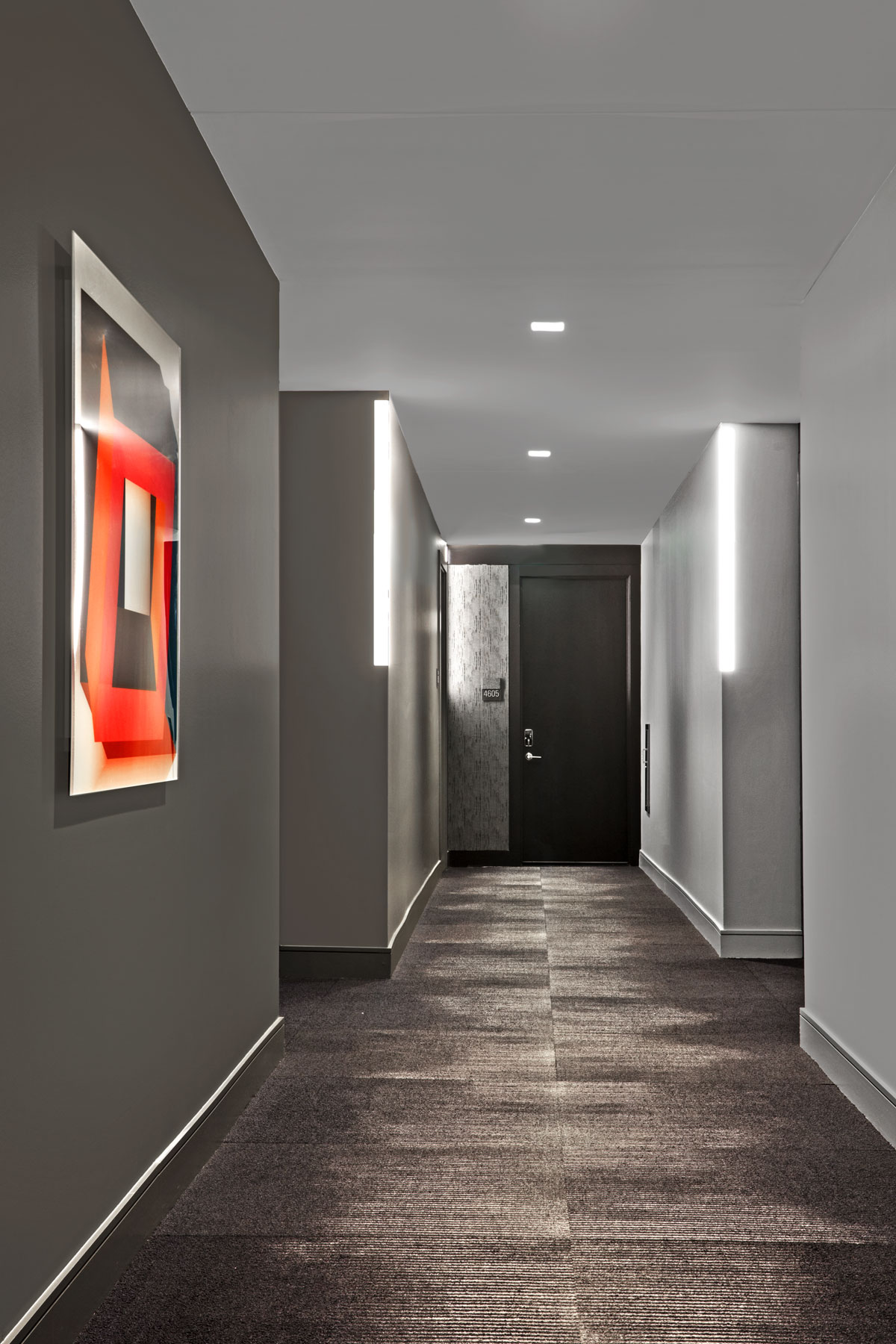
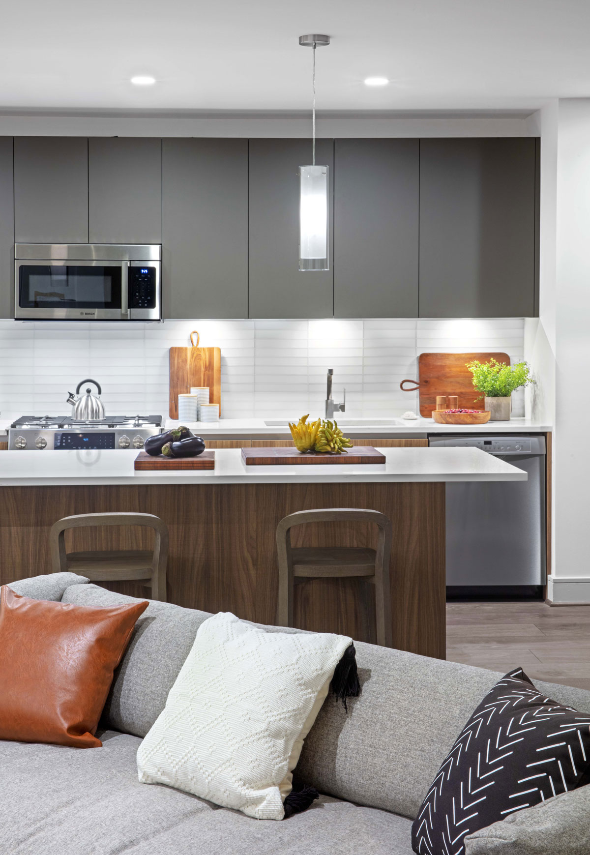
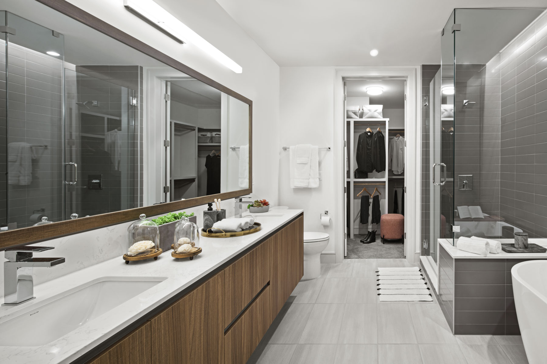
Levels 11 to 43 comprise the typical floor levels. The elevator lobby is located so that it has natural light and great exterior views. Each level has 11 units per floor ranging from 580-square-foot studios to 1,890-square-foot, two-bedroom units. The inboard units have a more traditional layout, while the corner units take advantage of the building’s geometry to create rich interior spaces and spectacular open views. Four units per floor have balconies and a special effort was made to make the balconies livable spaces. Protected on two or three sides from wind and a depth of at least 8 feet, they can be furnished with a dining table and a seating area. Providing “livable balconies” is becoming an important part of future vertical multifamily buildings in the United States.
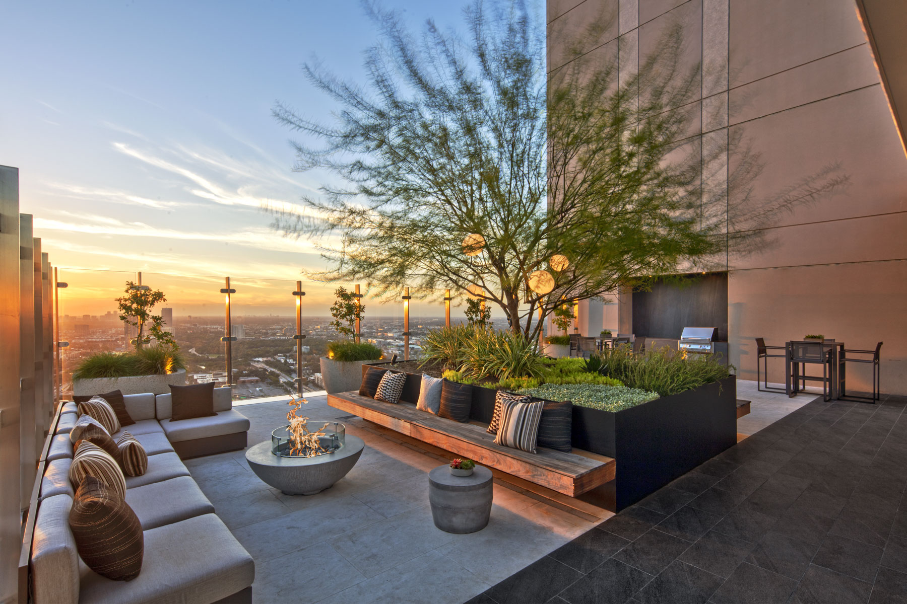
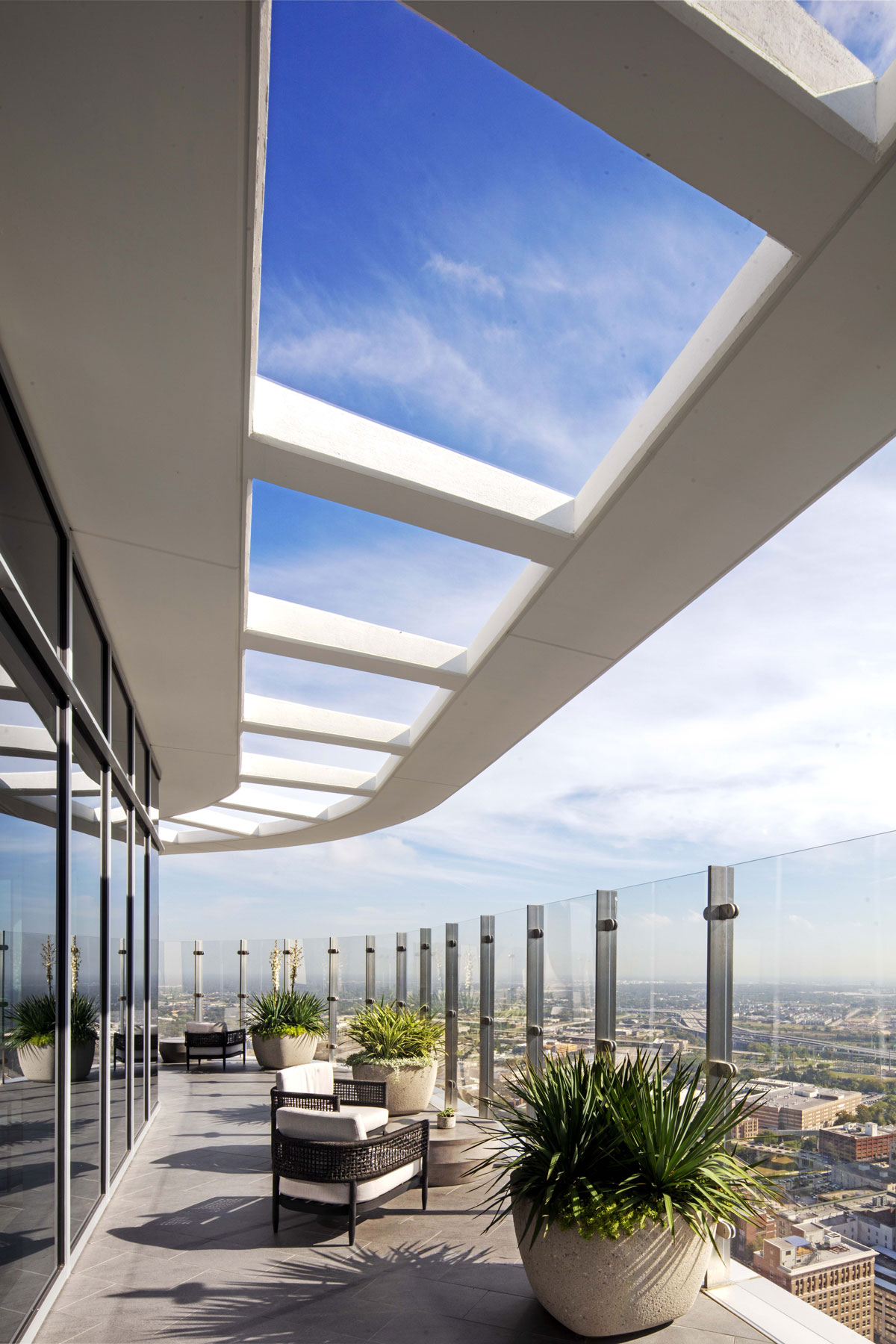
Levels 44 and 45 contain five penthouse units. A sky amenity space and a terrace for use by all residents is located on level 46, because everyone in a high-rise tower should have access to spectacular views from the top of the building.
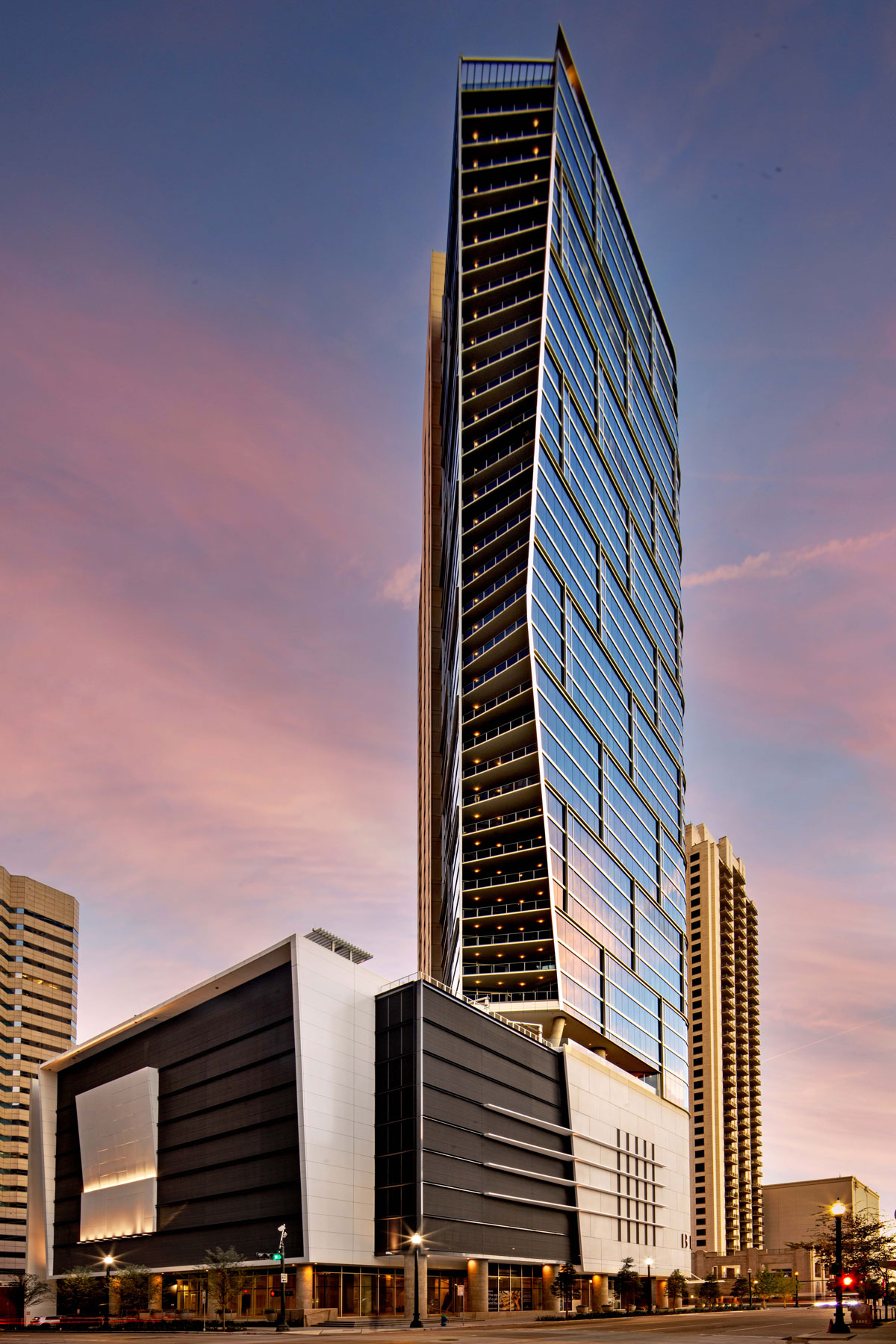
The massing of the building is solved with simple shapes and volumes that create dynamism and tension. A “glass sail” toward the northeast corner opens the building to Market Square and creates the main façade of the building. The glass volume is crowned by a metal trellis that acts as a building identifier from longer distances. All the glass in the building will be a Window Wall glass system in 4-foot vertical modules.
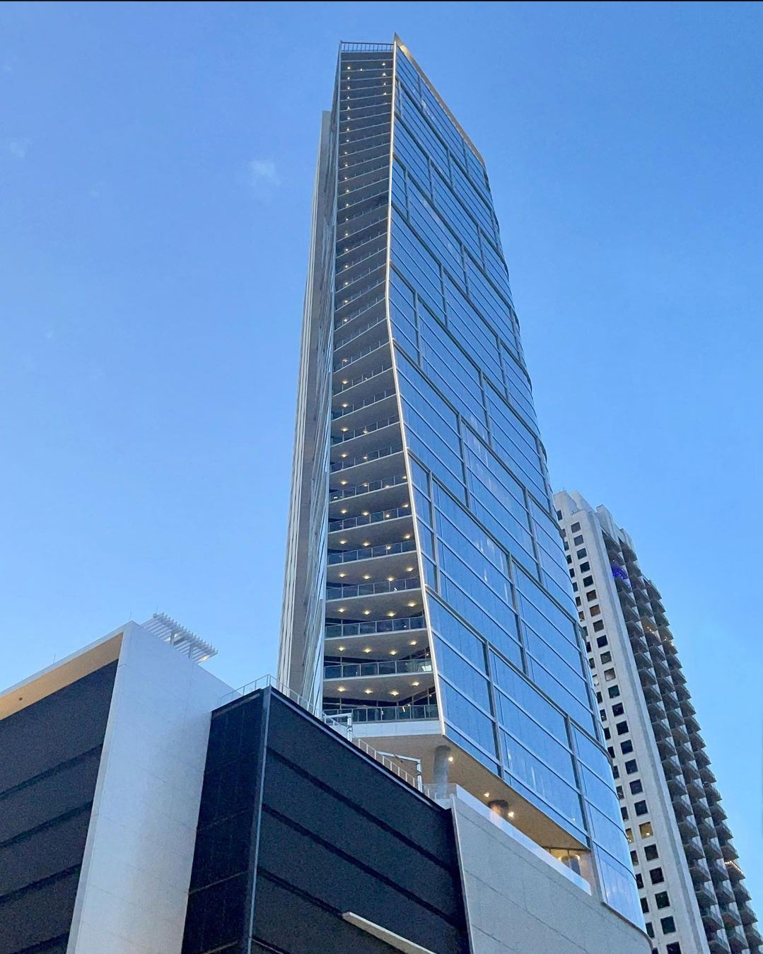
The glass sail on the north-east face of the building terminates on a sloping vertical line spanning the entire height of the tower. This line drifts in and out along its edge creating an interesting volume on the building. This effect gives the illusion of a sail being stretched by the wind. The balcony edges on that side twist as it ascends.
This combination of the glass sail, the undulating edge, and the sliding podium will make the slender tower appear dynamic and provide movement. It is the combination of the tower shape, similar to a sailboat, and the glass sail that make this tower appear to be unusually slender.
The design team worked toward the creation of a next generation. multifamily tower where the building architecture plays an important role in defining what the future looks like. Being at the edge of downtown, the site has an important presence from longer sightlines and is an important contribution to the Houston skyline.
The site is mostly surrounded by existing tall buildings: to the north the Market Square 43-story multifamily tower; to the south the Calpine building. The site to the east is currently being developed with a 10-story garage, and there are plans for a 50-story office tower on that site. However, there are important view corridors from the site that played an important role in how the building is massed and oriented. The project captures views to the Southwest of Jones Plaza, Pennzoil, and Bank of America; to the Northeast of Market Square Park; to the Northwest views of Sesquicentennial Park and long views to the Heights area and beyond; and finally, to the Southwest, views to the new Hines office building.
